
Documentation
Html-Tailwind Template
UiCamp Html-Tailwind Template is a creative & modern template, A perfect place for your creative portfolio. Multiple demoes are included in this template with lots of CSS and tailwind animations, Responsive based on TailwindCss.
- Author: UiCamp
- Last Update: 2 Jun, 2024
If you have any questions that are beyond the scope of this help file, Please feel free to contact us via UiCamp.
Features
- Build on HTML CSS
- Based on Tailwind
- Based On SCSS
- Creative layouts
- 100% Responsive
- Easy to Customize
- Minimal and Clean
- Fonts Awesome Icons
- Well Documentation
- Free Updates
- All files are well commented
- Displays well in all modern browsers
Files Include
[template_name]_Html-Tailwind
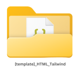
Folder contains main template code & all
HTML 5, json, scss,
css, images, fonts,
js files
[template_name]_Html-Tailwind_docs
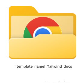
Documentation folder of "template_Html-Tailwind" written in
html
css
Installation
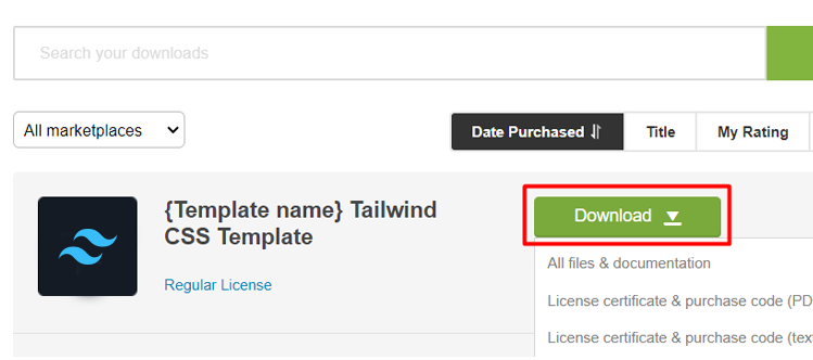
Follow the steps below to setup your template:
-
Download the latest theme source code from the
Marketplace.
-
Download and install Node.js and npm from Nodejs. The suggested version to install is
LTS.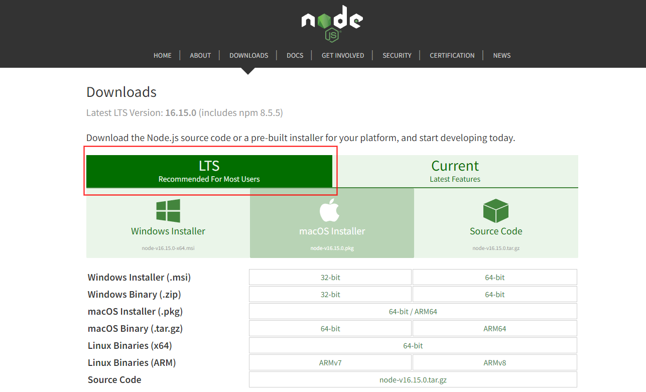
-
Open terminal in [template_name]_html-tailwind template folder.
> cd /[template_name]_html-tailwind/ -
Install npm packages.
You must have to install packages of your project to install all the tailwind server to can edit on style, You can do this by running the following command.
> npm install> npx tailwindcss -i ./src/main-in.css -o ./src/main.css --watch
open your project at the borwser
[root_folder] folder contains the whole
project folders & files
[root_folder] folder contains the whole
project folders & files
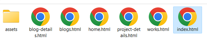
Click on name of page that you want
Deployment
You can deploy your project to any host that you need
We suggest some hosting you can consider to use:


Folder Structure
Template comes with a flexible file structure that can be easily used for small to large scope projects. This section will explain the entire file structure and how to adapt it to your project.
Root Folder
[root_folder] folder contains the whole project
folders & files
Root Folder Content:
| File/Folder | Description |
|---|---|
assets
|
Assets Folder is a folder that have all assets, images and style files that we use it at coding files |
[page_name].html
|
This file that have main code and data of page |
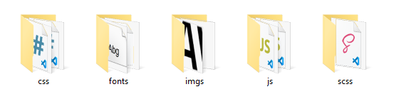
Assets Folder
[root_folder]/assets/ Assets folder that contains
all images , style source files and scripts files for functions.
[page_name]
[root_folder]/[page_name] file contains template
code that contain all data of page (HTML 5 code, built in
tailwind styles, and styles from our styles files).
Code Structure
Main template code structure
Page Code Structure
  <!DOCTYPE html>
  <html lang="zxx">

  <!-- ALL META DATA HERE AT <head> LIKE META TITLE AND ANOTHER THINGS THAT YOU NEED TO GET IT FROM ANOTHER FILES LIKE STYLES -->


    <head>
      <!-- Metas -->
      <meta charset="utf-8" />
      <meta http-equiv="X-UA-Compatible" content="IE=edge" />
      <meta
        name="viewport"
        content="width=device-width, initial-scale=1, maximum-scale=1"
      />

      <!-- Title  -->
      <title>Gavi</title>

      <script src="https://cdn.tailwindcss.com"></script>

      <script src="./dark/assets/js/tailwindCongfig.js"></script>

      <!-- Plugins -->
      <!-- <link rel="stylesheet" href="dark/assets/css/plugins.css" /> -->

      <!-- Core Style Css -->


    </head>


    <!-- ALL code of your body and what you see at your page are exist here at <body> you can edit what data that you need here  -->

    <body class="sub-bg" data-scroll-index="0">
    <section class="py-[100px]">
      <div
        class="w-full mx-auto xxl:max-w-[1280px] xl:max-w-[1140px] lg:max-w-[1024px] md:max-w-[768px] sm:max-w-[640px] mx-auto px-[3px]"
      >
        <div class="sec-head mb-[80px]">
          <div class="flex justify-center">
            <div class="px-[15px] lg:w-[75%] w-full">
              <div class="text-center">
                <h1 class="text-[70px] mb-[15px] font-[500]">GAVI</h1>
                <h4 class="font-[500] lg:text-[28px] text-[20px]">
                  Creative Personal
                  <span class="text-main">Portfolio</span> Template
                </h4>
              </div>
            </div>
          </div>
        </div>

        <div
          class="w-full mx-[-25px] mx-auto xxl:max-w-[1280px] xl:max-w-[1140px] lg:max-w-[1024px] md:max-w-[768px] sm:max-w-[640px] mx-auto px-[3px] grid md:grid-cols-2 md:grid-cols-1 item-canter justify-center gap-10"
        >
          <div
            class="card-item px-[25px] bg-dark border border-[#ffffff1a] rounded-30 py-[100px] px-[15px] md:px-[40px] lg:px-[50px] relative mt-[40px]"
          >
            <div class="relative p-[40px] z-3 mt-[40px]">
              <div
                class="border border-[#aaa] rounded-t-md rounded-b-none overflow-hidden"
              >
                <a class="z-3" href="dark/home.html" target="_blank">
                  <img src="demos/1.png" alt="" />
                </a>
              </div>
              <div
                class="custom-width ml-[-40px] h-[30px] border border-gray-400 rounded-b-full z-3"
              ></div>
            </div>
            <div class="text-center z-3">
              <h3 class="font-[500] md:text-[38px] sm:text-[24px]">
                Home Dark
              </h3>
            </div>
          </div>
          <div
            class="card-item px-[25px] bg-dark border border-[#ffffff1a] rounded-30 py-[100px] px-[15px] md:px-[40px] lg:px-[50px] relative mt-[40px]"
          >
            <div class="relative p-[40px] z-3 mt-[40px]">
              <div
                class="border border-[#aaa] rounded-t-md rounded-b-none overflow-hidden"
              >
                <a href="light/home.html" target="_blank">
                  <img src="demos/2.png" alt="" />
                </a>
              </div>
              <div
                class="custom-width ml-[-40px] h-[30px] border border-gray-400 rounded-b-full z-3"
              ></div>
            </div>
            <div class="text-center z-3">
              <h3 class="font-[500] md:text-[38px] sm:text-[24px]">
                Home Light
              </h3>
            </div>
          </div>
        </div>
      </div>
    </section>

        </body>
        </html>
Source & Credits
Images:
- Pexels - https://pexels.com
- Unsplash - https://unsplash.com
Images are only for demo purpose and not included with the download bundle.
Fonts:
- Google Fonts - https://fonts.google.com
Scripts:
- HTML - https://html.com
- TailwindCss - https://tailwindcss.com/
- Swiper Carousel - https://swiperjs.com
- GSAP Animations - https://greensock.com/gsap
Thank you for purchased UiCamp template
We truly appreciate and really hope that you'll enjoy our
template!,
If you like our template, plase rate us 5 star !